|
Scenic Brick in Three Steps |

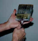
Spattering Spattering is an old, wonderful, versatile scenic technique for creating surface textures and adding character to painted finishes. It takes a bit of practice to gain the control required, but the results are well worth it. Start with a nice stiff brush with about 3" long bristles. Thin the paint enough that it runs off the brush easily but still covers the surface. Load the brush, wipe it off on the bucket, and then shake it out a couple of times to get rid of most of the liquid. Then hold the brush vertically in one hand with the bristles pointing up and tap it against the other hand. If you tap it just right, you will see a fine spray of droplets land on the surface in front of you. By varying the amount of paint, its consistency, and
the force of the tap, you can change the size of the droplets, the
pattern, and the coverage. This technique works just as well on
vertical surfaces as on horizontal ones, although more control is
needed on a vertical surface to avoid the paint running down the
wall. On the other hand, this could create some interesting drips... |
|
The following appeared in Issue #26 (Fall 2001) of Haunted Attraction Magazine, a publication for the dark amusement industry, and is reprinted by courtesy of the editor. By George F. Ledo A recent article in Issue # 22 of this publication described a technique for producing a nice three-dimensional faux brick effect fairly quickly, but did not address the issue of how to paint the surface to make it look real. As a theatrical designer who recently caught the haunting bug (cryptococcus terminalis, and the prognosis is very dark), I'd like to share a scenic painting technique for creating realistic-looking brick. The interesting thing about brick, from a designer's point of view, is that there are many variables-including the way it is laid, the colors used, and the size and evenness of the mortar joints-that can be used to create a specific effect. It all depends on the visual impression the designer or art director wants to present to the audience, such as the mood of the scene, the time of day, the location, the type of brick wall, its age and condition, and similar things. For this article, I wanted to create a brick wall in the basement of an old house. I selected a fairly common brick pattern and what is known as a "flush" or plain joint, which is made (in a real wall) by simply scraping off the excess mortar, level with the face of the brick. This joint is often found in old structures where appearance and/or weather resistance were not an issue, and is very appropriate for a haunted house. And, for our purposes, it can be created quickly because it is painted totally on a flat surface. The technique, assuming that the substrate (in this case, 4' x 8' plywood sheets) has already been treated with a flame-retardant product, is very straightforward and consists of three steps. First, we lay down a base coat of the brick color to define the overall appearance and character of the wall. Then, using brick-sized plywood cutouts (as described in Issue # 22) to mask the surface, we spray the mortar color. Finally, we remove the cutouts and spatter the surface with two or three additional colors to create the pockmarks and other surface imperfections in the brick. Since a lot of old buildings in my area (upstate New York) were built from a reddish-orange brick, I selected three suitable paint colors for the base coat: two slightly orange red-browns and a more intense sienna color. Then I used a "warm" gray mixed with a bit of flat white for the mortar. "Warm" grays, such as the color of cement, old bleached-out wood fences, and elephants, show a hint of brown, while "cool" grays, as seen on storm clouds, battleships, and the color you get when you mix black paint with white, show a hint of blue. To lay down the base coat, pour some of each brick color, thinned just a bit with water, into separate buckets, and some plain water into a fourth bucket. A great deal of scenic painting is done with the material flat on the floor because it's convenient and allows one or more painters to work standing up, move around on the surface, and see what theyre doing from a few feet away. In this case, all you need is one long-handled brush, which is made by taping a four-inch paintbrush to a dowel or piece of old broomstick. Using this one brush, mix all three colors onto the surface at random to create a mottled effect, using a bit of water occasionally to help smooth out the paint. This is called a "wet blend," although the paint should be spread out thinly so it dries quickly. Avoid hard edgesthe colors want to flow and mix together, not start and stop suddenly. Once you're done, stand back and look at it. Is it too light here or too dark there, or is there too much of one color in one area? If so, just put on a bit more paint and blend it in. But be careful not to overwork it: the trick in scenic painting is knowing when to stop. When the base coat is dry, lay out the brick cutouts and cover the surrounding surfaces with a plastic dropcloth. I used a 4 strip of plywood, with the brick spacing marked off in pencil, to speed up the layout process. Apply the mortar color using a garden tank sprayer (the hand pump type used for bug spray), making sure to strain the paint through cheese cloth or a very fine metal strainer before use. The paint should be just thin enough that it flows smoothly and provides good coverage without soaking the surface, and the pressure should be low enough that it will not blow the cutouts around. It takes a few tries to get the paint and the pressure just right, so be sure to practice on a scrap first. Two or three light coats will cover as well as one heavy coat, and will dry much faster. Before you remove the brick cutouts, spatter the entire surface with two or three darker shades of the gray mortar color to create some visual interest in the joints. For this, I mixed a small quantity of all three brick paints into some gray to get a dark brown color, and then added a bit of black and some water. Don't use straight black paint for this, as it is too intense and usually reads like black paint instead of like pits or shadows. If you apply the spatter coat lightly enough, it should be dry enough for you to to remove the bricks in a couple of minutes and move on to the next section. Now stand back again and look at the overall effect. Is the brick spacing too regular, or are the mortar lines too narrow or too wide? If so, simply adjust them for the next section. Once the entire wall is painted, use the gray mortar colors that you already have, and maybe a bit of white, to spatter the surface lightly to give it some texture and variation. Maybe one area wants to look darker than another, or needs more of one color. Since the spatter coats are light, they will dry fast, and you can go back over them as needed. Stand back frequently, look at your creation, and stop just when you think, "it needs a bit more." Please note that a brick wall doesn't always have to be "brick" color. A nice moonlit effect can be obtained by painting the surface, including the mortar, in shades of blue. For instance, a few years ago I designed a set for an outdoor show at Six Flags Great Adventure in New Jersey. Part of the set represented Merlins castle, a large pile of rock in the middle of a lagoon, complete with Stonehenge-type arches. Because the show was only presented in the evenings, I had the set painted in shades of blue to reinforce the feeling of a mysterious castle in the moonlight. For the example in this article, I used two 4 x 8 sheets of plywood for the wall, and made enough brick cutouts to cover about a third of a sheet. It took me about half an hour to lay down the three base colors, and maybe five to seven minutes to arrange the bricks each time. The mortar spray and spatter took only a minute to apply and maybe ten to dry before I could move the bricks (although I got carried away a couple of times, put on too much paint, and had to wipe off the bricks before re-using them). The final spatter coats took a bit longer because I was adjusting the overall effect, but they dried fast. The end result was exactly what I wanted: a quick, accurate representation of the brick walls in the old industrial buildings in my area.
|